
AI-Powered Session Highlights That Doubled Parent Engagement
Redesigned Outschool's post-class recording experience using LLM-generated highlights, doubling engagement and improving weekly return rates by 50%.
TL;DR
Parents couldn't see the value of classes because reviewing meant watching full recordings.
Research revealed the gap wasn't content quality but effort to access proof of value.
Chose a YouTube-style UI over TikTok/Reels patterns to reduce parent learning curve.
Shipped LLM-generated session highlights with timestamped key moments and recaps.
Engagement doubled, conversion to recordings page hit 80%, and weekly return rate improved by 50%.
Parents were paying for classes they couldn't see the value of
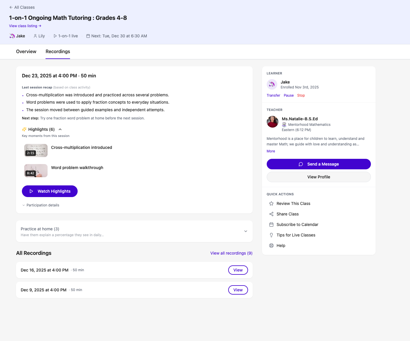
After every live class (group session or tutoring) on Outschool, parents received an email with a link to a class recording. But the only way to understand what their child actually learned was to sit through the entire video, which were sometimes an hour long. Most parents never did. The result was a massive gap in perceived value: teachers were delivering real value to learners in class, but parents could only see the value as reflected off their learners (and kids are notoriously tight-lipped when asked "how was class?"). Parents had no efficient way to see the value for themselves. Without that sense of value, parents were less likely to re-enroll their children in future classes, directly threatening retention and lifetime value.
This was the situation
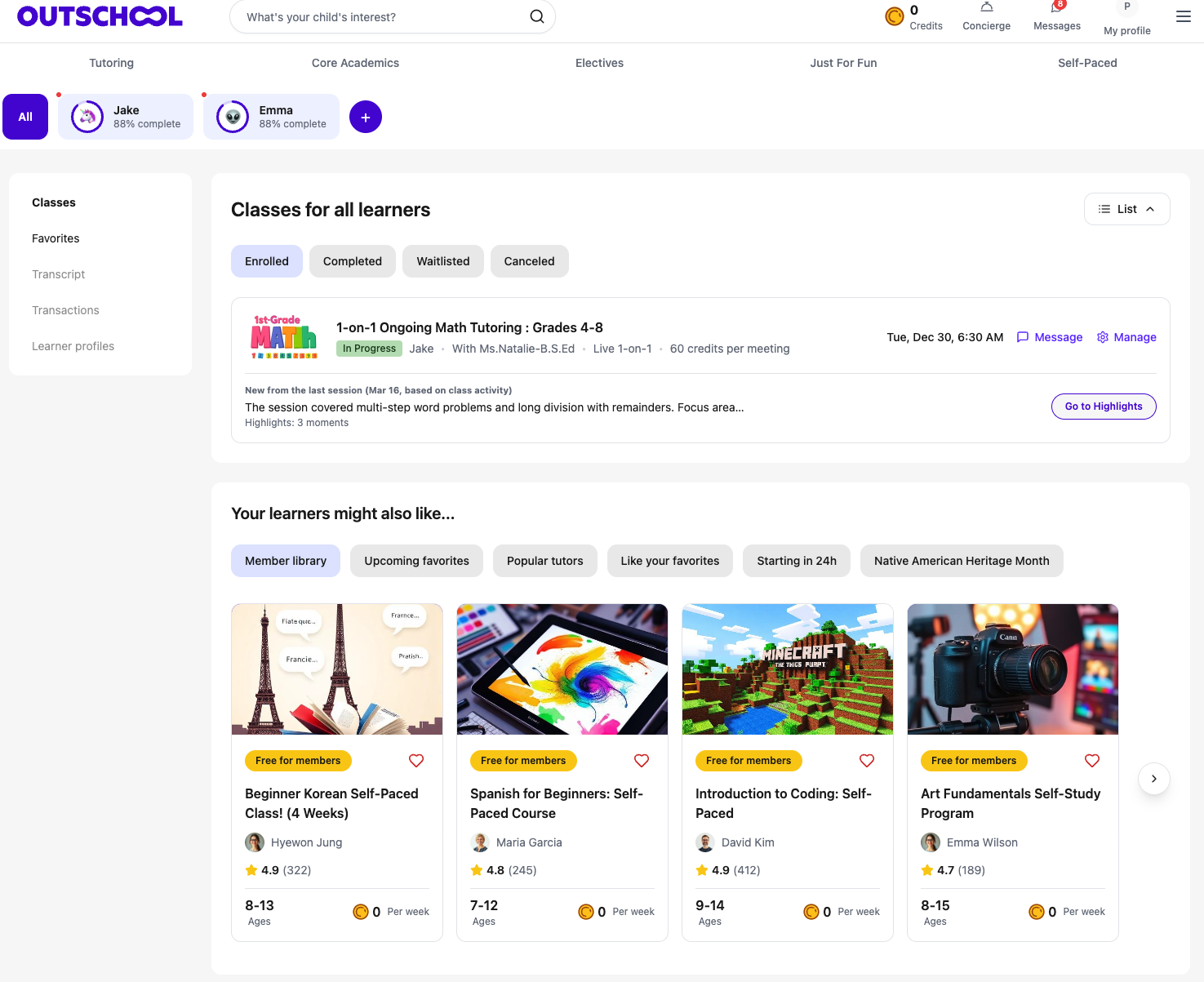
Outschool is an online education marketplace offering live classes for children, including 1-on-1 tutoring sessions. Parents enroll their kids in recurring weekly classes across subjects like math, reading, and electives. I was the product manager on this initiative. I prioritized the work, conducted parent research and interviews, developed the requirements, and assisted with design and implementation alongside the design and engineering team. The existing post-class experience was minimal: parents saw a list of enrolled and completed classes, with recordings available but no guidance on what to watch or what to do next. Many of our classes repeated on a weekly cadence, which meant the window to demonstrate value and drive re-engagement was narrow, roughly seven days before the next session.
The problem wasn't class quality, it was the cost of discovering it
Through parent interviews and research, I discovered that the core issue wasn't dissatisfaction with the teaching. Parents generally trusted Outschool's teachers. The real barrier was the effort required to validate that trust. Watching a full 50-minute recording was too high a cost for a busy parent who just wanted to know: did my child learn something today, and what should we practice at home? This reframed the problem entirely. We didn't need to improve class quality. We needed to surface proof of value with near-zero effort from the parent. If we could show parents the key moments and takeaways in seconds rather than asking for nearly an hour, we could close the perception gap that was silently eroding retention.
Choosing familiarity over novelty in the UI
This insight meant we needed a UI that parents could navigate instantly without onboarding. We explored several directions before settling on the final approach.
TikTok/Reels-style vertical highlight clips vs. YouTube-style video page with sidebar highlights
A short-form vertical video UI felt modern and aligned with how people consume highlights on social platforms. However, parents on Outschool are in a different mindset: they want to feel informed, not entertained. I chose the YouTube-style layout because parents already understood the mental model of a video player with a sidebar of chapters and timestamps. Even though we couldn't replicate YouTube features like recommended videos or comments, the spatial familiarity meant parents could orient themselves immediately and jump to specific moments without learning a new interaction pattern.
Highlights-only vs. highlights plus text summary
We considered showing only video highlights at specific timestamps. But I pushed to include a text-based session recap below the video as well. Some parents might not have time to watch any video at all. The text summary gave them a 10-second scan option, while highlights served parents who wanted to see specific moments. This layered approach meant we addressed multiple levels of parent effort.
AI-generated highlights that let parents skip to what matters
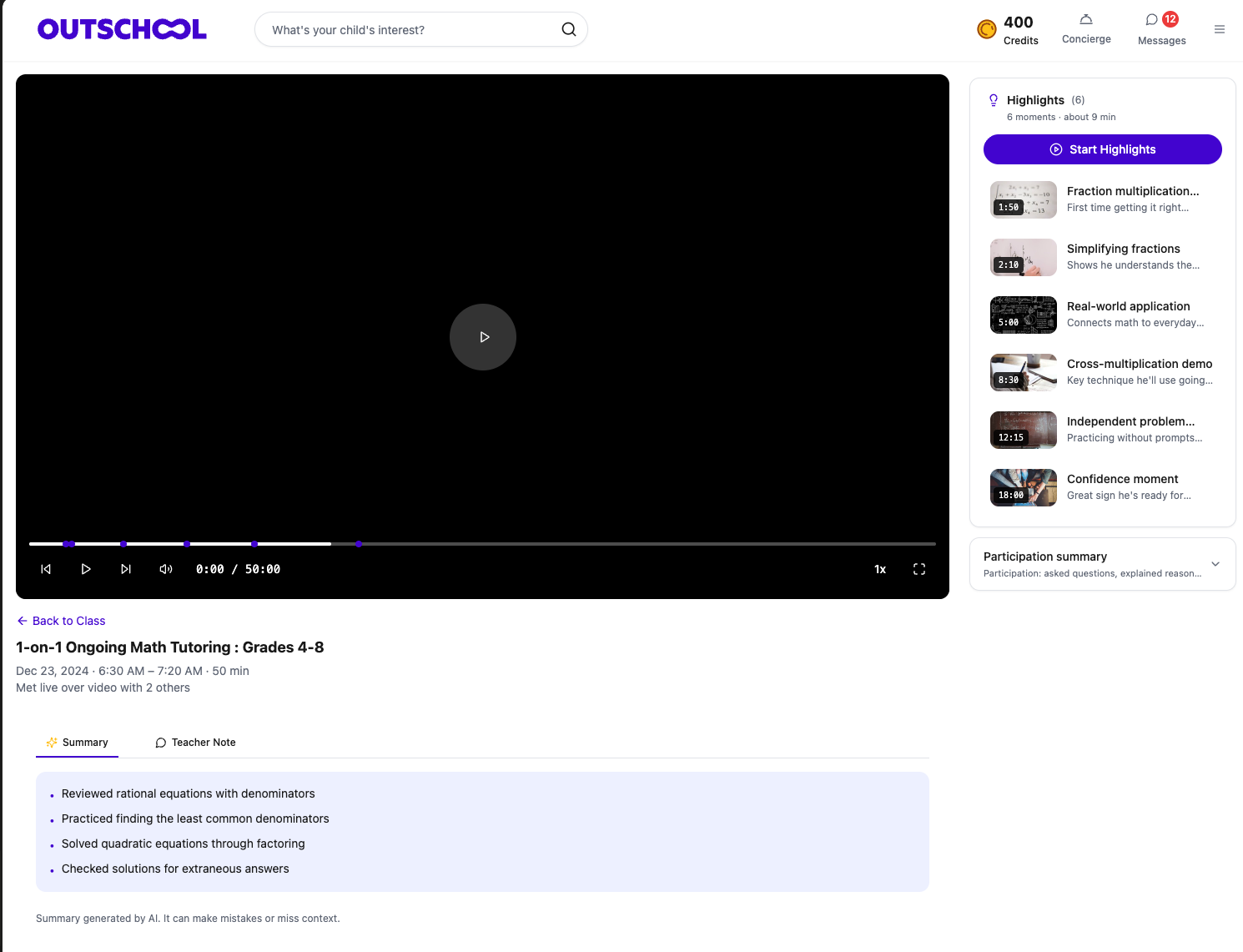
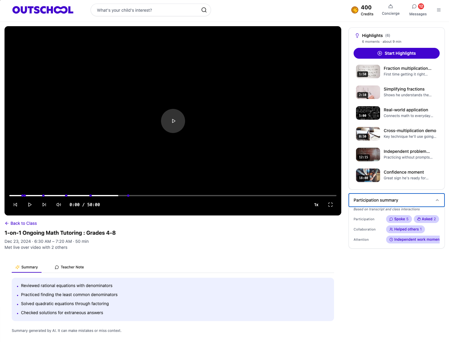
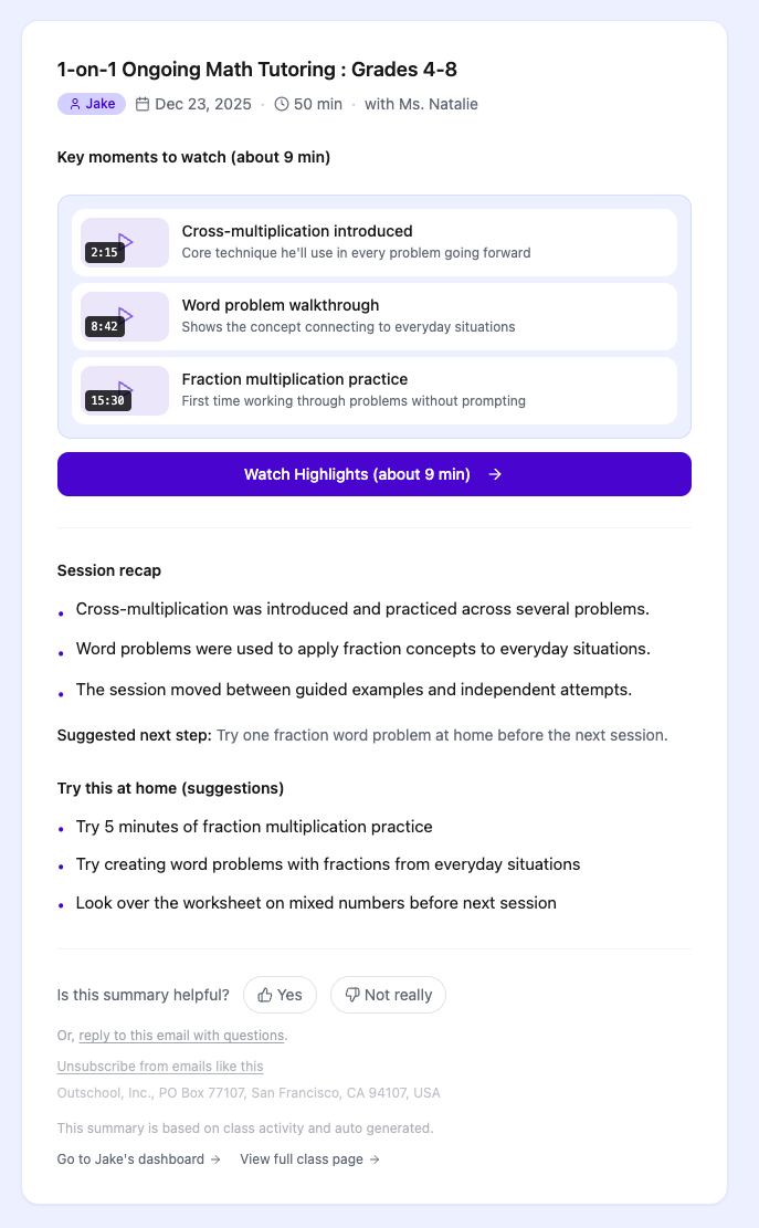
Building on these decisions, we created a new post-session recordings experience that transformed a passive 50-minute video into an active, scannable summary. We used Claude Haiku to automatically process class transcripts and identify key learning moments, linking each one to a specific timestamp in the recording. We chose Haiku specifically for its balance of speed and cost, since accuracy was good enough for identifying topic transitions and key instructional moments. The new recordings page featured a video player with highlighted timestamp markers on the timeline, a sidebar listing each key moment with its title and duration so parents could jump directly to something like "Cross-multiplication demo" at 12:15, and a text-based session recap below the video summarizing topics covered and suggesting home practice activities. The page also included quick actions for communicating with the teacher, reviewing the class, and managing enrollment. The result was that a parent could understand what happened in a 50-minute tutoring session in under 30 seconds.
Here's what I owned
As the product manager, I owned this initiative end-to-end from prioritization through launch. I identified the retention risk through parent research, framed the opportunity for leadership, and drove the decision to invest in this work. I personally conducted the parent interviews that surfaced the core insight about effort-to-value. I developed the product requirements, including the decision to use LLM-generated highlights rather than teacher-curated ones, and I defined the success metrics we would track. I worked closely with the designer on the UI direction, advocating for the YouTube-style layout based on research findings, and partnered with engineering on the LLM integration approach, including the choice of Claude Haiku for the right cost-speed-accuracy tradeoff. The design team owned the visual and interaction design, and engineering owned the transcript processing pipeline and front-end implementation.
Engagement doubled and parents came back
As a result of shipping the new recordings experience, we saw immediate and sustained improvements across the metrics that mattered most for retention.
How we worked together
To bring this to life, I partnered closely with our designer to evaluate the competing UI directions, using parent research findings to resolve debates about layout and information hierarchy. I worked with engineering to define the LLM processing requirements and evaluate model options, ultimately aligning on Claude Haiku after testing accuracy against cost and latency constraints. The weekly cadence of our target classes created natural urgency, which helped keep the team focused and shipping incrementally. I want to thank our designer for translating a complex information architecture into something parents could scan in seconds, and our engineers for building a reliable AI pipeline that processed transcripts and generated highlights at scale.